Chapter 17. Demand, Supply, and Equilibrium#1: Graphing the Demand Curve
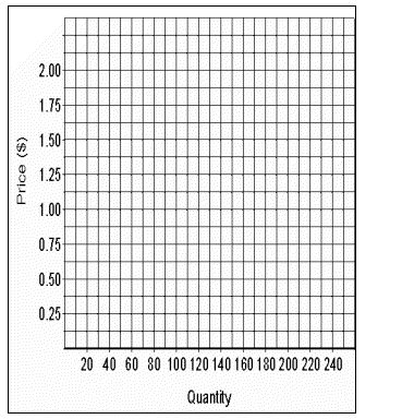
The key to drawing a graph correctly is planning the graph before you actually draw it. Try to picture how it will look on your piece of graph paper. We're going to be drawing a graph of the demand schedule shown in Table 17.1, so try to picture this graph taking up perhaps three-quarters of your page.
Table 17.1. Demand Schedule for Sanford Sharpie Ultra Fine Point Permanent Markers| Price | Quantity Demanded | Price | Quantity Demanded | | $2.00 | 4 | $1.00 | 64 | | 1.75 | 9 | 0.75 | 105 | | 1.50 | 16 | 0.50 | 160 | | 1.25 | 32 | 0.25 | 235 |
You want the price axis to extend about three quarters of the way up your sheet of graph paper; your quantity axis should extend about three quarters of the way across your sheet. Go ahead and draw your axes, labeling them "price" and "quantity."
Now label your price axis from 0 at the bottom to $2.00 at the top. When you mark off the quantities on the quantity axis, you obviously cannot mark off each unit of quantity, because you would be writing out 235 numbers. Even marking off every 5 or 10 units would make your graph too 'busy." I'd mark off every 20 numbers, numbering quantity at 0, 20, 40, 60, etc. Or, alternately, you could mark off 0, 25, 50, 75, etc. Go ahead now and mark off your price and quantity axes. After you've set up your graph, check to see if it looks like mine in Figure 17.1.
 <a onClick="window.open('/olcweb/cgi/pluginpop.cgi?it=gif:: ::/sites/dl/free/0072237409/30181/image06.gif','popWin', 'width=NaN,height=NaN,resizable,scrollbars');" href="#"><img valign="absmiddle" height="16" width="16" border="0" src="/olcweb/styles/shared/linkicons/image.gif"> (24.0K)</a> <a onClick="window.open('/olcweb/cgi/pluginpop.cgi?it=gif:: ::/sites/dl/free/0072237409/30181/image06.gif','popWin', 'width=NaN,height=NaN,resizable,scrollbars');" href="#"><img valign="absmiddle" height="16" width="16" border="0" src="/olcweb/styles/shared/linkicons/image.gif"> (24.0K)</a>
Figure 17.1
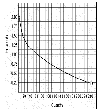
The next step is to put dots on the graph representing each of the pairings of price and quantity demanded. Your first dot will be at a price of $2 and a quantity of 4. After you have placed all your dots, you're ready to connect them. Do not connect them with a ruler or straight edge. Connect them freehand, so that your demand curve looks like a smooth curve, and label the curve D, or demand. Once you have done this, compare your graph with mine in Figure 17.2.
 <a onClick="window.open('/olcweb/cgi/pluginpop.cgi?it=gif:: ::/sites/dl/free/0072237409/30181/image07.gif','popWin', 'width=NaN,height=NaN,resizable,scrollbars');" href="#"><img valign="absmiddle" height="16" width="16" border="0" src="/olcweb/styles/shared/linkicons/image.gif"> (19.0K)</a> <a onClick="window.open('/olcweb/cgi/pluginpop.cgi?it=gif:: ::/sites/dl/free/0072237409/30181/image07.gif','popWin', 'width=NaN,height=NaN,resizable,scrollbars');" href="#"><img valign="absmiddle" height="16" width="16" border="0" src="/olcweb/styles/shared/linkicons/image.gif"> (19.0K)</a>
Figure 17.2 #2: Graphing the Supply Curve
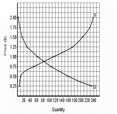
Graphing the supply curve is virtually is same a graphing the demand curve. We're going to use the supply schedule shown in Table 17.2. To save time, please draw a supply curve on the same sheet of graph paper that you used for your demand curve. Be sure to label your curve S, or supply.
Table 17.2 Supply Schedule for Sanford Sharpie Ultra Fine Point Permanent Markers| Price | Quantity Supplied | | $2.00 | 240 | | 1.75 | 230 | | 1.50 | 205 | | 1.25 | 172 | | 1.00 | 115 | | 0.75 | 53 | | 0.50 | 10 | | 0.25 | 5 |
Check to see that your supply curve looks like the one I drew in Figure 17.3. Keep in mind that you want the graphs you draw to be large, accurate, and very easy to read, because you'll be using these graphs to help you do economic analysis.
 <a onClick="window.open('/olcweb/cgi/pluginpop.cgi?it=gif:: ::/sites/dl/free/0072237409/30181/image08.gif','popWin', 'width=NaN,height=NaN,resizable,scrollbars');" href="#"><img valign="absmiddle" height="16" width="16" border="0" src="/olcweb/styles/shared/linkicons/image.gif"> (23.0K)</a> <a onClick="window.open('/olcweb/cgi/pluginpop.cgi?it=gif:: ::/sites/dl/free/0072237409/30181/image08.gif','popWin', 'width=NaN,height=NaN,resizable,scrollbars');" href="#"><img valign="absmiddle" height="16" width="16" border="0" src="/olcweb/styles/shared/linkicons/image.gif"> (23.0K)</a>
Figure 17.3 #3: Find Equilibrium Price and Quantity
We can usually make a pretty good estimate of the equilibrium price and quantity by looking at the intersection of the supply curve and the demand curve. But keep in mind that we drew those curves using the data in Tables 1 and 2. Which data are more accurate, then, the data from the tables or the data from the graph in Figure 17.3?
Clearly the numbers from the tables are more accurate, since they are our original source of data. So after we make our estimates of equilibrium price and quantity from the graph, we'll need to check back with the data in Tables 17.1 and 17.2. But to make that a lot easier, we've combined the demand schedule from Table 17.1 and the supply schedule from Table 17.2 into Table 17.3.
Table 17.3. The Demand and Supply Schedules for Sanford Sharpie Ultra Fine Point Permanent Markers| Price | Quantity Demanded | Quantity Supplied | | $2.00 | 4 | 240 | | 1.75 | 9 | 230 | | 1.50 | 16 | 205 | | 1.25 | 32 | 172 | | 1.00 | 64 | 115 | | 0.75 | 105 | 53 | | 0.50 | 160 | 10 | | 0.25 | | |
OK, what is your best estimate of equilibrium price and quantity from Figure 3, or, better yet, from your own graph?
The equilibrium price looks like $.875 and the equilibrium quantity looks like 82. Of course two people looking at a graph can easily come up with two different readings, so your equilibrium price and quantity may be a little different from mine. And they almost certainly will be different if we each read them from our own graphs.
Let's see what Table 17.3 tells us about equilibrium price. We know that at that price, quantity demanded equals quantity supplied. We also know that at a price of $1.00, quantity demanded is 64 and quantity supplied is 115. So at a price of $1.00, quantity supplied is 51 pens greater than quantity demanded. And at a price of $.75 quantity demanded is 105 and quantity supplied is 53 - a difference of 52.
At a price of $1.00, the difference between quantity demanded and quantity supplied is 51, and at a price of $.75, the difference between quantity demanded and quantity supplied is 52. So we may conclude that we are very slightly closer to equilibrium at $1.00 than at $.75. In other words, we can say that equilibrium price is very slightly closer to $1.00 than to $.75.
So how much is equilibrium price? We know that $.875 is exactly half way between $1.00 and $.75. Since we want a price that's slightly closer to
$1.00, we can call equilibrium price $.88, or even $.876.
What about equilibrium quantity? That requires more work than finding equilibrium price. Quantity demanded is 64 at a price of $1.00 and 105 at a price of $.75. So we're looking for a quantity demanded that is very slightly closer to 64 than to 105. The number midway between 105 and 64 is 84.5. So we're looking for a number very slightly less than 84.5 - say, 84.3.
Quantity supplied is 115 at a price of $1.00 and 53 at a price of $.75. We're looking for a quantity demanded very slightly closer to 115 than to 53. The number midway between 53 and 115 is 84. We're looking for a number very slightly more than 84. Hey - why not 84.3. Or 84.4 or 84.2 or 84.1?
#4: Finding Equilibrium Price and Quantity without a Graph
Problem: At a price of $10, quantity demanded is 40 and quantity supplied is 50. At a price of $9, quantity demanded is 48 and quantity supplied is 42. Find equilibrium price and quantity.
Solution: At a price of $10, quantity supplied (50) is 10 greater than quantity demanded (40). At a price of $9, quantity demanded (48) is 6 greater than quantity supplied (42). So which is closer to equilibrium price, $10 or $9?
The answer is $9, because quantity demanded and supplied are much closer to equilibrium than at $10. At $9, quantity demanded and supplied are just 6 apart, while at $10, they're 10 apart. So how much, then, is equilibrium price?
Equilibrium price is much closer to $9 than to $10. How much closer? Could we say that $9.45 is much closer to $9 than to $10. Not really. How about $9.40? Maybe. I'd be more comfortable with, say, $9.35. Surely $9.35 is much closer to $9 than $10.
Now we come to the harder part - finding equilibrium quantity. Our quantity demanded is 40 at a price of $10 and 48 at a price of $9, so we want a quantity demanded that is much closer to 48 than to 40. Would 47 be OK? Wouldn't you say that 47 is much much closer to 48 than to 40? How about 46? That's fine. How about 45? That's also fine.
Our quantity supplied is 50 at a price of $10 and 42 at a price of $9. What number is much closer to 42 than to 50? We can't use 46 because that's midway between 42 and 50. How about 45? That works.
So we'll settle on 45 for our equilibrium quantity. A little more than 45 and a little less than 45 would also work. |


 2002 McGraw-Hill Higher Education