 |
| 1 |  | 
As a math project, Rawinder collected data on the genres of music favoured by his classmates. He wanted to see if there was a difference between the choices made by girls as opposed to boys. A good way of displaying this data is |
|  | A) | a comparative bar graph |
|  | B) | a circle graph |
|  | C) | a histogram |
|  | D) | a line graph |
|
|
 |
| 2 |  | 
Which of these is least suitable for displaying numeric data? |
|  | A) | Fathom™ |
|  | B) | The Geometer's Sketchpad® |
|  | C) | a spreadsheet |
|  | D) | a graphing calculator |
|
|
 |
| 3 |  | 
The middle value of a set of data is known as the |
|  | A) | mean |
|  | B) | mode |
|  | C) | median |
|  | D) | sample |
|
|
 |
| 4 |  | 
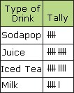
Some grade 8 students were asked to select a cold drink for the class picnic. The results are shown. How many students were in the sample?
 <a onClick="window.open('/olcweb/cgi/pluginpop.cgi?it=jpg::::/sites/dl/free/0070917612/198825/Math8_CH09_Quiz_Q4.jpg','popWin', 'width=NaN,height=NaN,resizable,scrollbars');" href="#"><img valign="absmiddle" height="16" width="16" border="0" src="/olcweb/styles/shared/linkicons/image.gif"> (6.0K)</a> <a onClick="window.open('/olcweb/cgi/pluginpop.cgi?it=jpg::::/sites/dl/free/0070917612/198825/Math8_CH09_Quiz_Q4.jpg','popWin', 'width=NaN,height=NaN,resizable,scrollbars');" href="#"><img valign="absmiddle" height="16" width="16" border="0" src="/olcweb/styles/shared/linkicons/image.gif"> (6.0K)</a>
|
|  | A) | 15 |
|  | B) | 20 |
|  | C) | 25 |
|  | D) | 30 |
|
|
 |
| 5 |  | 
A total of 120 students are expected to attend the class picnic. According to the sample in question 4, how many cartons of milk should be provided? |
|  | A) | 24 |
|  | B) | 18 |
|  | C) | 12 |
|  | D) | 6 |
|
|
 |
| 6 |  | 
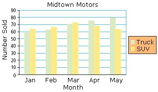
A comparative bar graph for sales of trucks and SUVs at Midtown Motors for five months is shown. Based on the graph, what advice would you give the manager?
 <a onClick="window.open('/olcweb/cgi/pluginpop.cgi?it=jpg::::/sites/dl/free/0070917612/198825/Math8_CH09_Quiz_Q6.jpg','popWin', 'width=NaN,height=NaN,resizable,scrollbars');" href="#"><img valign="absmiddle" height="16" width="16" border="0" src="/olcweb/styles/shared/linkicons/image.gif"> (16.0K)</a> <a onClick="window.open('/olcweb/cgi/pluginpop.cgi?it=jpg::::/sites/dl/free/0070917612/198825/Math8_CH09_Quiz_Q6.jpg','popWin', 'width=NaN,height=NaN,resizable,scrollbars');" href="#"><img valign="absmiddle" height="16" width="16" border="0" src="/olcweb/styles/shared/linkicons/image.gif"> (16.0K)</a>
|
|  | A) | Order more SUVs than trucks in June. |
|  | B) | Order more trucks than SUVs in June. |
|  | C) | Order the same number of each in June. |
|  | D) | Reduce orders of both in June. |
|
|
 |
| 7 |  | 
From the graph in question 6, which month showed the biggest gap between sales of trucks and SUVs? |
|  | A) | Jan |
|  | B) | Feb |
|  | C) | Apr |
|  | D) | May |
|
|
 |
| 8 |  | 
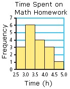
Students were asked how many hours they spent each week on math homework. The results are shown in a histogram. Which interval contained the greatest number of students?
 <a onClick="window.open('/olcweb/cgi/pluginpop.cgi?it=jpg::::/sites/dl/free/0070917612/198825/Math8_CH09_Quiz_Q8.jpg','popWin', 'width=NaN,height=NaN,resizable,scrollbars');" href="#"><img valign="absmiddle" height="16" width="16" border="0" src="/olcweb/styles/shared/linkicons/image.gif"> (9.0K)</a> <a onClick="window.open('/olcweb/cgi/pluginpop.cgi?it=jpg::::/sites/dl/free/0070917612/198825/Math8_CH09_Quiz_Q8.jpg','popWin', 'width=NaN,height=NaN,resizable,scrollbars');" href="#"><img valign="absmiddle" height="16" width="16" border="0" src="/olcweb/styles/shared/linkicons/image.gif"> (9.0K)</a>
|
|  | A) | 2.5 h - 3.0 h |
|  | B) | 3.0 h - 3.5 h |
|  | C) | 3.5 h - 4.0 h |
|  | D) | 4.0 h - 4.5 h |
|
|
 |
| 9 |  | 
From the graph in question 8, what is a reasonable estimate for the maximum amount of time a student spends per week on math homework? |
|  | A) | 5.0 h |
|  | B) | 4.0 h |
|  | C) | 3.5 h |
|  | D) | 3.0 h |
|
|
 |
| 10 |  | 
From the graph in question 8, how many students were interviewed? |
|  | A) | 18 |
|  | B) | 17 |
|  | C) | 16 |
|  | D) | 15 |
|
|

