(See related pages)
Working With GraphsInterpreting GraphsEconomics at the introductory level makes heavy use of graphs. The following remarks may be of help to those who have had little experience in using these types of tools. Graphs can be used for two purposes: description and analysis. In description, they are used to give visual expression to data of various types. Suppose we have obtained some data showing total emissions of Sulfur Dioxide (SO2) from power plants participating in the SO2 permit trading program.
A graph can be used to render these data in pictorial form. The graph consists of a space defined by two axes, with each axis containing a scale on which the data can be oriented. For example, the data above can be depicted graphically: 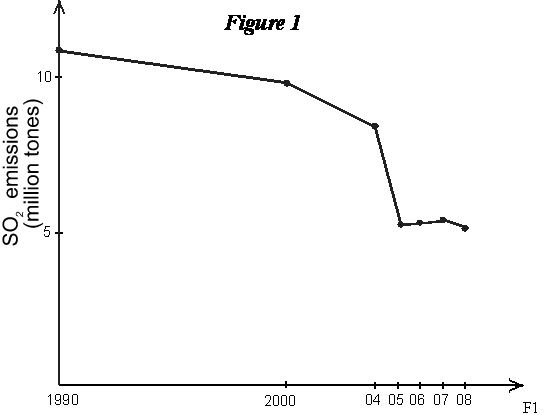 Or the data could be depicted using a bar diagram: 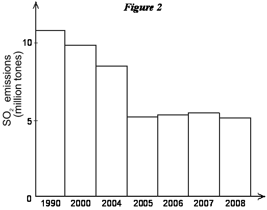 In both these cases we are simply showing some data in a pictorial, or graphical, form. Doing so often makes the data more vivid and illuminating than simply showing it in numerical form. In the graph, for example, it is very easy to see the sharp drop in SO2 emissions that occurred in 1995 among this group of power plants. But these graphs are purely descriptive. In their analytical role, we use graphs to explore interrelationships and connections among important elements of a situation. Suppose you are given the following data:
We could construct a graph of these data. On the horizontal axis we would put an index of lead used in gasoline production, varying from 40 to 100 tons per period, and on the vertical axis an index of the average lead content of blood, in micrograms per deciliter. The graph of these data would look like the following: 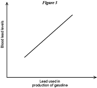 These data are descriptive; however, they go beyond this to depict a causal relationship. The burning of leaded gas was a major source of atmospheric lead, which is what caused elevated lead levels in the blood. (It's this relationship that was instrumental in leading to the decision to phase out leaded gasoline in the U.S.) In this case the causal factor is the quantity of lead used in making gasoline, and the impacted factor is blood-lead level. In analytical language, these are sometimes referred to as the independent factor (or variable) and dependent factor (or variable), respectively. The graph depicts the nature of the functional relationship (which we will sometimes refer to as simply the function) between these two factors. It depicts an increasing relationship: as the quantity of land used in gasoline increases, blood-lead levels increase.
ShapesGraphs may come in any number of different shapes, however. Suppose, for example, we are interested in the relationship between the amount of the entrance fee to visit a public park and the number of people who visit that park. We might expect a negative relationship, as depicted below: 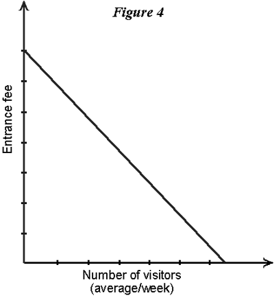 Note that there are no actual numbers on the axes in this case. We are interested only in the general nature of the function, i.e., at higher entrance fees visitation will be lower. So the actual numbers on the scale need not be specified. A point that we will come back to is the following: There are normally lots of factors that affect park visitation rates, not solely the entrance fee. But Figure 4 shows only the relationship between the two variables: entrance fee and visitation. We have to understand that this function expresses the connection between these two factors with other things assumed constant. In other words, at higher or lower entrance fees this function shows how visitation will respond, on the assumption that all other factors that might affect visitation are remaining unchanged. Of course in the real world this is hardly ever true; everything is usually in constant change. The reason for singling out just these two variables and assuming everything else is constant is because we wish to explore the nature of the connection between these two important factors. Thus, in this particular graph (or model) we are temporally abstracting from other factors that might have an impact on visitation. The last two graphs show linear relationships, i.e., the functions are straight lines. Curved functions are also common. The following graph shows two curved graphs. Panel (a) shows a graph that increases at a decreasing rate, while panel (b) shows one that decreases at an increasing rate. 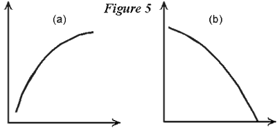 In the next section we will talk about these shapes in more detail, bringing in the concept of the slope of the function. Before going on, however, let's be clear on just what the graph is telling us. When we label the axes and draw the graph, we are asserting that the two variables are related in a certain way. In Figure 6 below, the graph shows, for example, that the value x1 on the horizontal axis is connected to (or a leads to, or a is associated with) a value of y1 on the vertical axis. A value of x1, on the other hand, is linked by the function to a value of y2. And so on for any point on the function. Each point on the graph tells us what value of y is related to the corresponding value of x1. 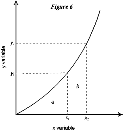 Another value that we may sometimes be interested in is the area under the graph. In Figure 6, for example, we might be interested in the total area under the graph from the origin (the interaction of the two axes) to, say, the value x1. In the diagram this area is labeled with the letter a. If the graph was a straight line, we could find the value of this area by multiplying x1 by y1 and dividing it in half. But since the graph is a little curved, we can't do this here. In fact we would have to use some advanced math to calculate this area specifically. But in using graphs to analyze various economic problems we won't normally have to do this. It is enough to be able to see visually whether one area is larger or smaller than another. For example the total area under the curve from the origin to x2 is (a + b), which is clearly larger than the area up only to x1.
SlopesNow in graphs used to depict relationships among variables we might be interested in knowing more than simply whether they are increasing or decreasing, but also how fast the increase or decrease is. In the following figure, for example, the response of the dependent variable (in this case the amount of wood in a tree) to the independent variable (the age of the tree) is a lot faster in the first shaded period than in the second. 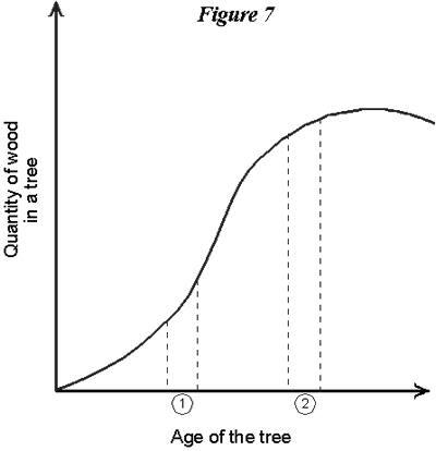 The graph is steeper in the first period than in the second. A way we have of registering this is by considering the slope of the graph at any point. In the next graph there are two points depicted on a curved relationship, and a dotted straight line drawn between them. That dotted line, since it is straight, has a unique slope. 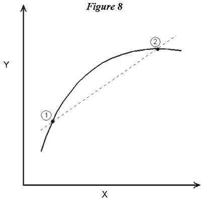 Now suppose point So now we can look back at the graph depicting the tree growth curve. In region A linear function (i.e., a straight-line graph) has a slope that does not change as one goes from one point on it to another. Curved functions obviously have slopes that change. What the slope of a function actually tells us is something about the way the variables in the graph are related, in particular it tells how much of a change we will get in the dependent variable (the one on the vertical axis) if there is a small change in the independent variable (on the horizontal axis). In the following figure there are two relationships, this time between the number of boats on a fishery and the catch per boat. They refer to two different fisheries, so they have somewhat different shapes. Both graphs go through the point (e1, y1), but function A has a steeper slope at this point than does function B. This means that, for a small change (increase or decrease) in the number of boats, there will be a bigger response (in terms of the change in yield per boat) in fishery B than in fishery A. 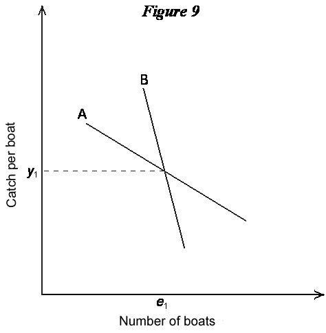 To the Top ShiftsAs mentioned above, a graph depicts only the relationship between the variables indicated on the axes. Of course, there are normally other variables that affect the typical dependent variable. Thinking back to the park visitation function, for example, we know that other things besides the entrance fee affects visit rates; for example, the number of people living in a nearby city, weather, changes in transportation costs (say a new road), and life-style changes. All of these other factors are assumed to be constant when we move up and down a particular function between entrance fee and visitation. But one way in which we can bring other factors into the analysis is as shifters of the relationship we are dealing with. A shifter is simply a factor that moves original function one way or another. Consider the following graph. It shows the relationship between entrance fee and visitation at a public park. Function A is the original relationship. 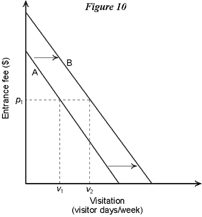 According to this, for example, an entrance fee of p1 would lead to a visitation rate of v1. Now suppose there is a change in another variable affecting visitation, for example a new road is built that lowers the time needed to get to the park. This in effect lowers the travel cost associated with visiting the park. But travel cost is not one of the variables on the two axes of the graph. Instead, what the travel cost change does is cause the whole entrance fee/visitation function to shift. The new relationship between our graphed variables is labeled B, and it lies to the right of the old relationship because the travel costs have been decreased by the new road. Now an entrance fee of p1, for example, will lead to a visitation of v2, which is higher than the old one. This other factor (transportation costs) acts as a shifter of the relationship of interest. Of course the shift can be up or down, outward or back, depending on the variables that are involved. The next graph shows a relationship between the numbers of wolves in a certain region and damages that ranchers suffer in that region from livestock losses. This is simply an illustrative relationship, so actual numbers are not indicated on the two axes. It's an increasing relationship, with a slope that gradually gets steeper as wolf populations increase. The original relationship is A. A change now occurs, this being a substantial increase in livestock fencing that controls cattle herds to a greater extent than before. The effect of this is to shift the whole wolf/damage relationship, in this case downward. Graph shifts don't have to be always nice and uniform, as the one in Figure 11 looks. A shifting factor might change that moves the lower part of the graph a lot, but doesn't move the upper part of the graph. Or a factor could change that actually leads to a rotation of the function, say an increase in the lower region and a decrease in the upper region. 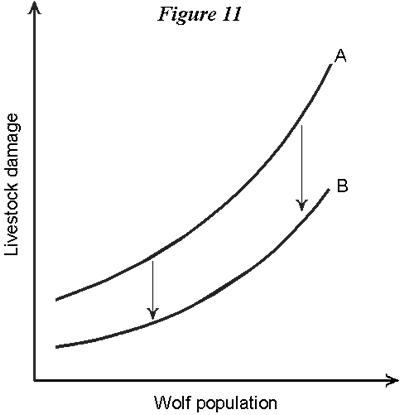 To the Top |


